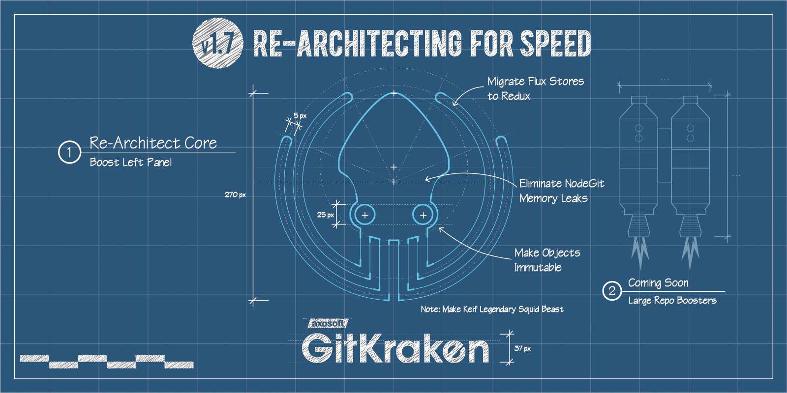
You’re probably confused about the subhead here. If you’re not, then you know about HGTV’s wildly popular show about two brothers who improve homes: one rolls out the blueprints while the other rolls out the wallpaper.
If you’re not familiar, just know that in this release, our super important left panel—which is kind of like the kitchen in a house—got demoed and had some new appliances installed. So it’s improved architecturally and visually.

Our UX improvements will help you whip up some code like a master chef; we fixed some performance issues on the back end that have improved stability and speed. Ready for the tour?
Welcome to your new kitchen! And don’t forget to check out the release notes!
Sticky Headers
What’s better than a brand new backsplash? Sticky Headers! Check ‘em out. Both are aesthetically pleasing and allow for easy clean up.
Things used to get lost as you scrolled down in the left panel. Now, headers lock to the top of the screen as you scroll down.
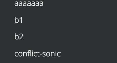
Sticky Headers before v1.7
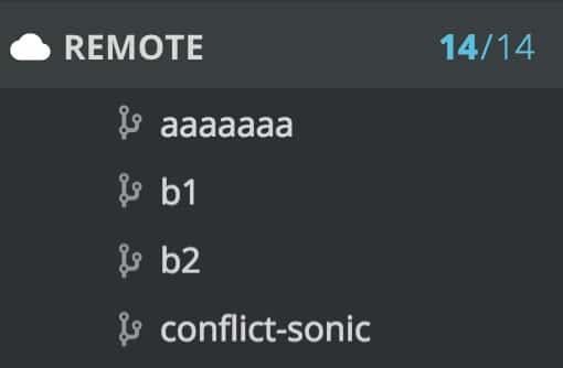
Sticky Headers after v.1.7
Check Out Indicator
Did you know that there’s a refrigerator that can tell your smartphone what to put on your grocery list?! This feature is just like that.
Now, when you checkout a branch, you’ll see that it has a green check box. Previous to this release, the only indicator you had that a branch was checked out, was seeing it framed by a border with bolder font. Honestly, it was a little unclear. Now, you know at a glance!

Checked Out branch previous to v1.7

Checked Out branch after v1.7
Yeah, it’s time to get some more strawberries; your roommate ate the last one.
Solo Improvement
Check out your brand new cupboards! You have space to put all your pots and pans away neatly, so you won’t be searching for that elusive spaghetti pot.
Previous to this release, to access the “solo” and “hide” buttons, you had to hover to reveal animations of the hide/show/solo buttons in order for them to show up.
Now, to solo, you simply right click in the context menu. Once you’re in a soloing state, additional branches can be soloed by clicking on the solo icon next to those branches.

Solo before v1.7
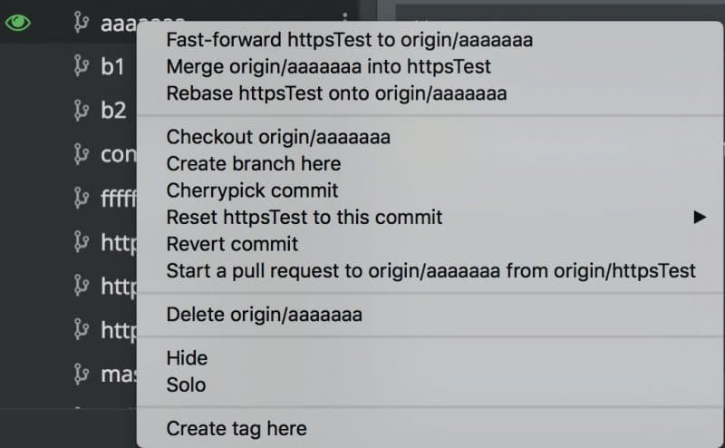
Solo in Context Menu after v1.7
See, it’s like opening a new, organized pantry where everything you need is right at your fingertips.
At-a-Glance Icons
Wouldn’t you love a brand new stove that lets you see how your frozen pizza is progressing? Is the cheese melted now? Ok, how about now? No more guessing!
V1.7 gives you more icons to make it easier to identify branches, tags, PRs, stashes, and more as you scroll down. And, what’s more, if you have a stash, it will show you a stash menu that has an icon identifier of its own!
Check out some new icons!

Branch icon after v1.7

Remote icon after v1.7

Stash icon after v1.7
Consistent Button/Icon Placement and Clearer Drag and Drop
Your old fluorescent lights just got replaced with the soft glow of some well-placed pendant lights. Softer on your eyes, and you will no longer hear that annoying hum every time you flip the switch.
The list of items no longer slides over to show you the button. Now, the button is always just there when you hover so now there’s no disappearing act going on.
Also, the Add button for remotes, pull requests and submodules is now consistently aligned all the way to the right instead of just showing up next to what you want to add.
In fact, all buttons that open the sliding panels for actions, like adding a remote and creating a PR, are now all aligned to the right of the row.

Button alignment before v1.7

Right alignment for buttons after v1.7
Additionally, you’ll notice that the drop down icons are consistent and don’t disappear.
We’ve upgraded the drag and drop feature so it’s a bit clearer. Previous to this release, when you would drag and drop, everything was orange, and what you were hovering over was green.
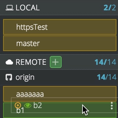
Drag and drop before v1.7
Now, when you hover over an item, a target icon appears next to it.
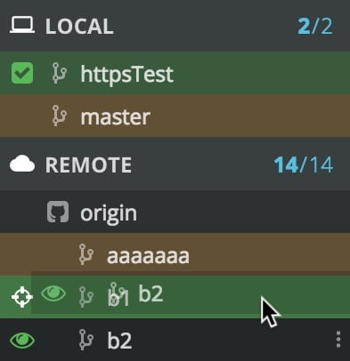
Notice the “target” to the left by the cursor after v1.7
New Discounted Pro Pricing For Teams
You already know that GitKraken is our free Git client for personal, open source, nonprofit, and educational use.
We also have GitKraken Pro, which provides additional features for commercial use, including an in-app merge conflict editor, multiple profiles, support, and more features yet to come.
We want to make it a no-brainer for your whole team to use our Git GUI (regardless if some users are on Windows, Mac, and/or Linux)!
So we’re offering new GitKraken Pro team pricing, which will help you save 50% per user per year when you purchase a 10 user plan, 67% off at 100 users, and as much as an 83% discount at 1,000 users!
As you can imagine, there are certain breakpoints where it makes sense to bump up to the next highest plan, even if you don’t have quite that many users yet.
So, here’s the breakdown! If you’re ready to purchase, and you select 5-66 users, we’ll recommend the 10 user plan. If you select 67-499 users, we’ll recommend the 100 user plan, and for 500+ users we’ll recommend the 1,000 user plan. For even larger teams, please contact our sales team to get the best pricing!
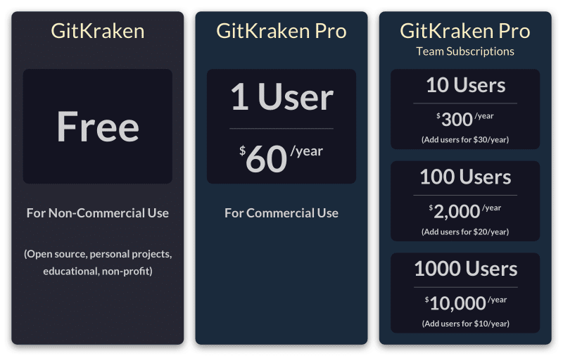
These plans will allow your team to grow with GitKraken Pro and not have to worry about adjusting your plan until you hit a breakpoint. So spread the word, it’s time for your whole team to go Pro!
Now, go over to the release notes to learn more about this classy, modern release!


 GitKraken MCP
 GitKraken Insights
 Dev Team Automations
 AI & Security Controls